
Case study · Resident app redesign
Role
Product Designer, sole designer
Project
Redesign of a live product
Timeline
2020–2021 · 6 months
Platform
iOS
Status
Shipped
From the first audit to launch
Core flows redesigned
New features added
Navigation pattern doing three jobs
Directory
This case is organized like the building
01
The building
02
What went wrong
03
How I learned it
04
Strategy
L0
Entry
L1
Information
L2
Actions
L3
Logistics
05
One Saturday
06
The system
07
Results
08
Learnings
01
The building
Weve serves a property management company that runs high-end condominiums in Miami, Texas, New York and Las Vegas. Residents use it to let people in, book shared spaces, collect packages and follow building news.
Nobody signs up. The management team creates each account during onboarding, so the app always starts from a known resident and a known unit. Behind it, the front desk works in a web system, and the buildings run facial scanners and QR lockers.
Weve sits between the resident, the front desk and the building’s hardware.
02
What went wrong
The app had gained visitor management, bookings, package tracking and community news. Each one was added where it fit at the time. The company’s engineering team reached out because residents found the app harder to use than it should be.
The problem wasn’t missing features. It was where they lived.
What the audit found
01
Unclear information architecture
02
Weak visual hierarchy
03
Low-contrast gradient background
04
Inconsistent iconography
05
Too many features on each screen
06
Irregular spacing
07
Operational and informational content mixed
08
Fragmented navigation
What it cost
01
Complex task flows
02
Constant context switching
03
Higher cognitive load
04
Slower and abandoned tasks
05
More calls to the front desk
When residents couldn’t finish a task in the app, they asked the staff. The app was creating work instead of removing it.
Illustrative, not the original interface. Each feature became one more entry, in the order it was built, so actions, information and logistics ended up mixed.
The problem, defined
Who
Residents of high-end condominiums who use the app several times a week.
What blocked them
Actions, information and logistics mixed together, with no shared structure.
What it cost
Slower and abandoned tasks, and more work for the front desk.
How might we reorganize what already exists so residents can complete everyday tasks on their own, without adding new features?
03
How I learned it
I couldn’t talk to residents or building staff directly. Their voice reached me through the complaints the company’s team had collected, so I built the diagnosis from three sources.
Stakeholder interviews
Several sessions with the company’s team, who knew which tasks generated complaints.
Usage metrics
The data they shared showed where residents slowed down or gave up.
Heuristic audit
A screen-by-screen review of structure, hierarchy and consistency.
That limit shaped the method. Every decision had to trace back to a reported complaint or a pattern in the metrics, never to taste.
04
Strategy
Four principles guided every screen. The third one became the architecture.
01
Real tasks first
Group by what residents do, not by isolated modules.
02
Less to hold in mind
Clear hierarchy, progressive disclosure, shorter flows.
03
Separate the layers
Information, actions and logistics each get their own place.
04
Built for daily use
Repeated tasks get speed and predictable patterns.
Four tabs, three layers. A fifth tab, Other, holds secondary services outside this case.
L0
Entry
The management team creates every account during onboarding, so the app has no registration flow. I kept one door: a single button that hands over to Face ID, with email and password one step away.
Residents get in with a glance. The company controls who has an account.
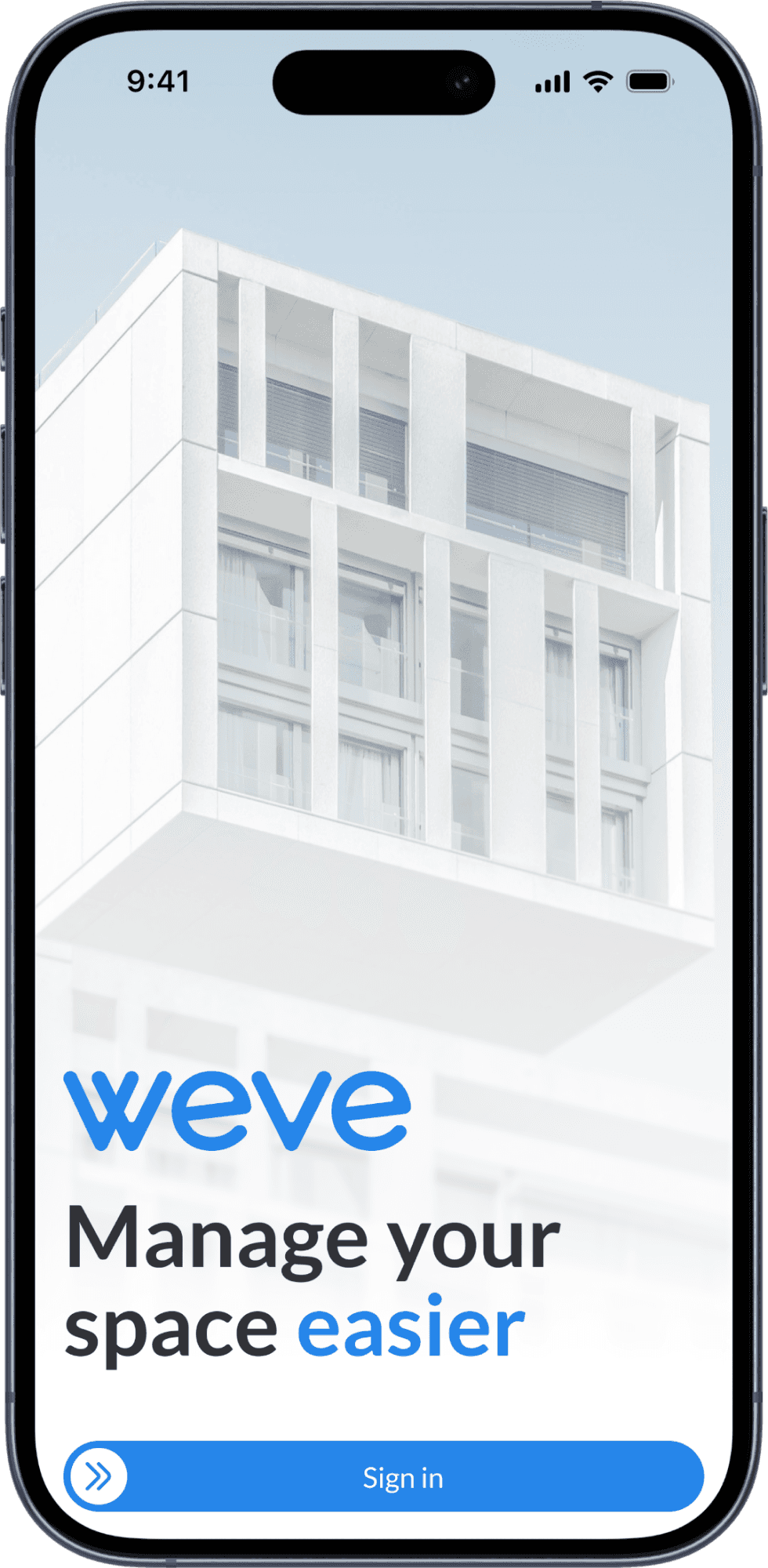
Welcome
One action on screen
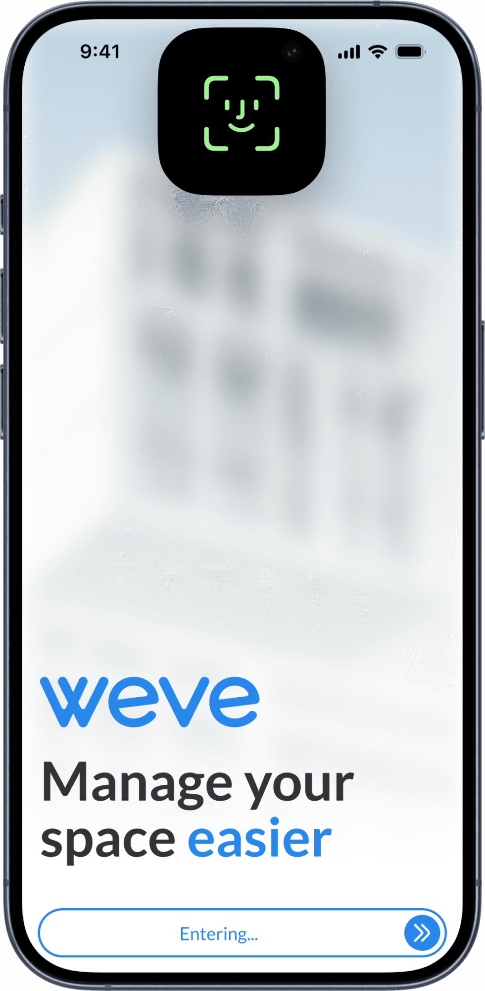
Face ID
The button shows progress
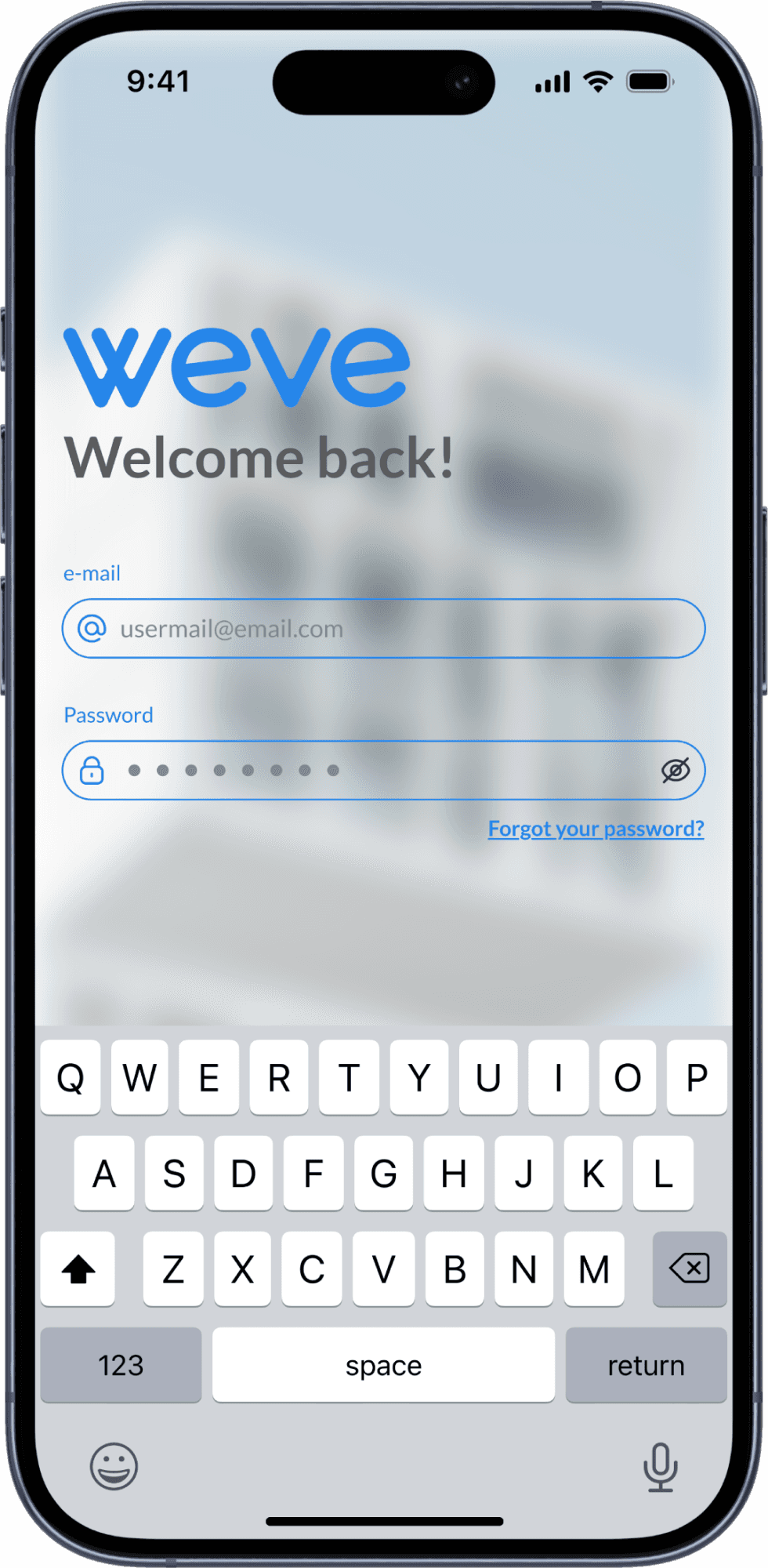
Email fallback
Labels above every field
L1
Information
Residents can own units in more than one building. I placed the building and unit at the top of every main screen, with a selector, so each action happens in the right place.
Home carries the management team’s news. Notifications group by day and point to the module that needs attention.
Reading the news and acting on it no longer compete on the same screen.
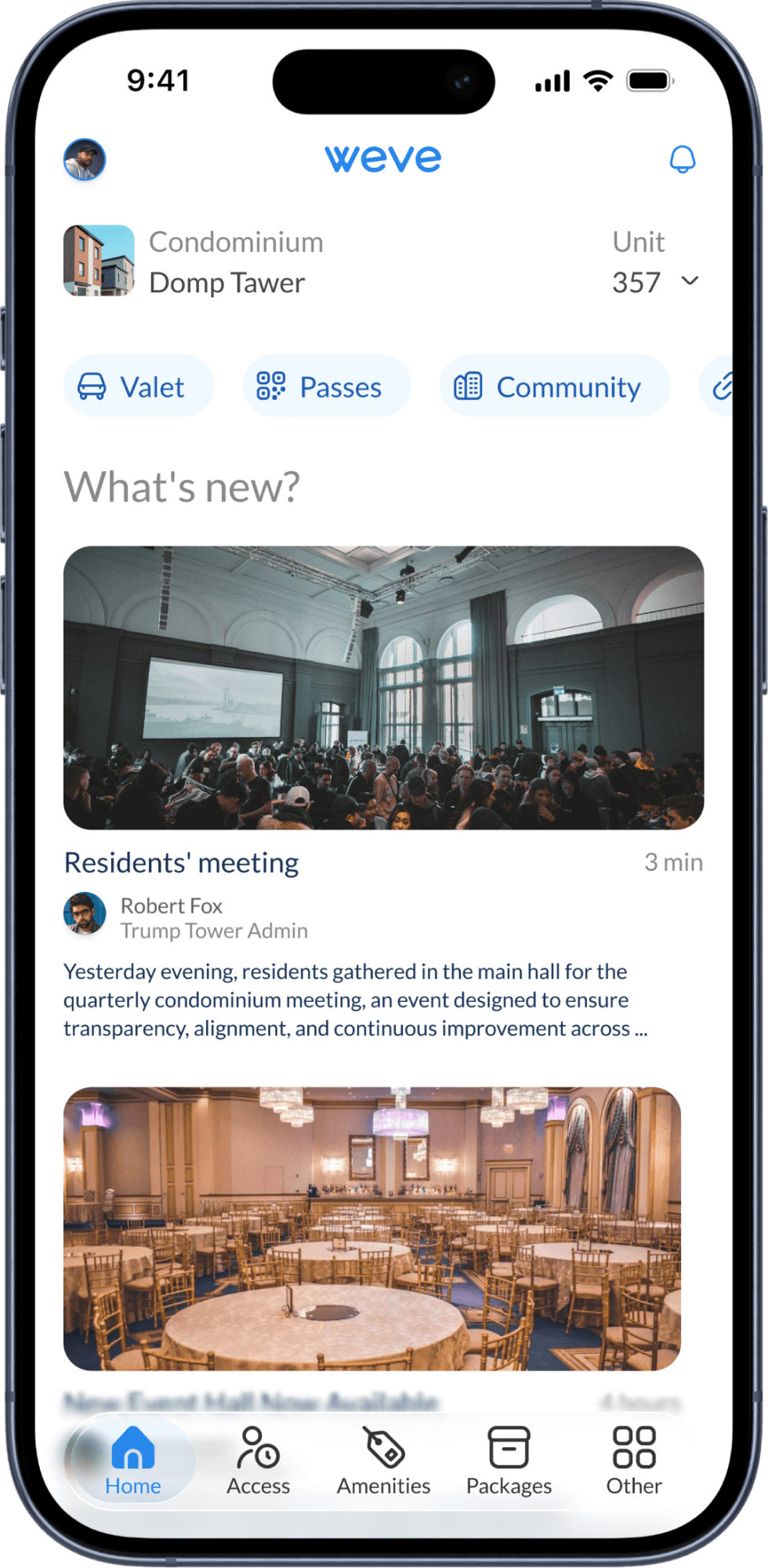
Home
Context first, news below
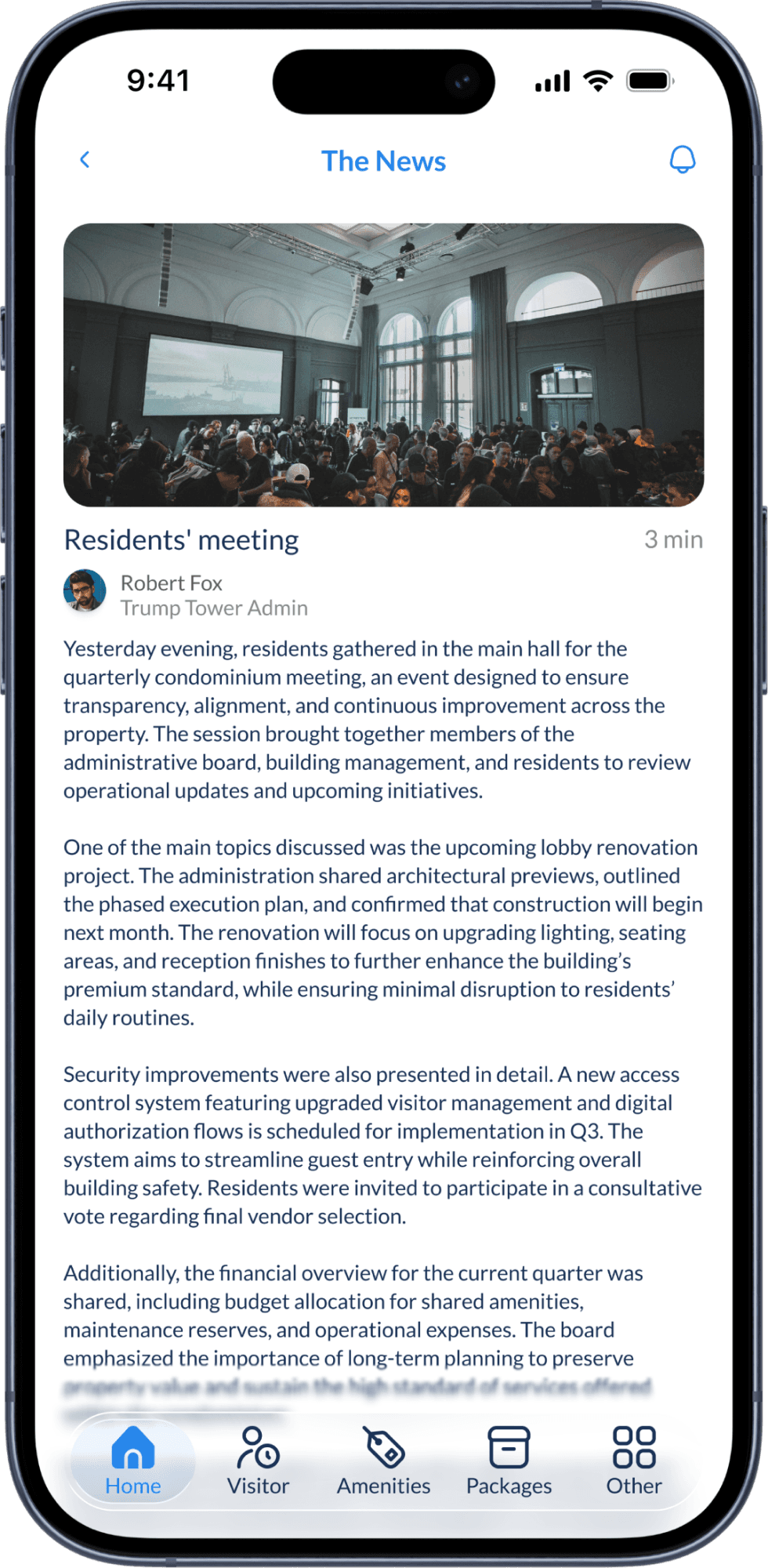
News
Signed by the building admin
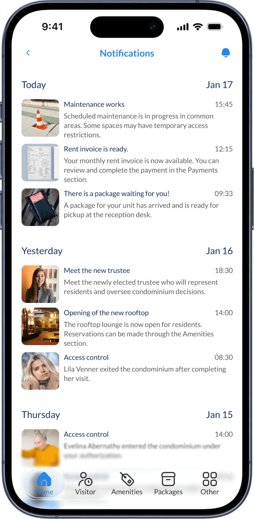
Notifications
Grouped by day
L2
Actions · Access
Visits shows what happened. Authorized shows who can enter, when and where. Parties handles guests in groups. One segmented control switches between them, and the “+” in the header starts a new authorization.
At the door, most buildings use facial scanners. A visitor registers on the first visit and walks in after that.
Residents manage access themselves instead of calling the front desk.
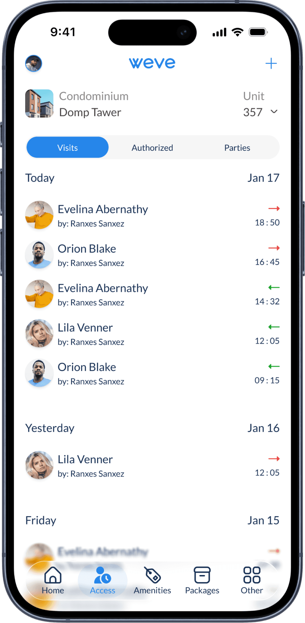
Visits
Every entry and exit
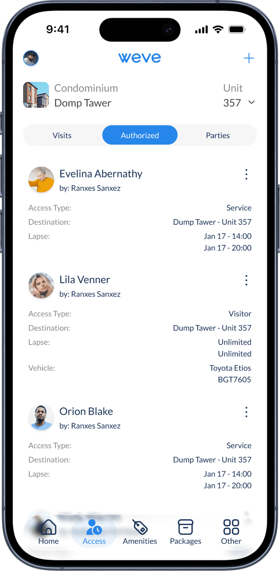
Authorized
Type, place and time window
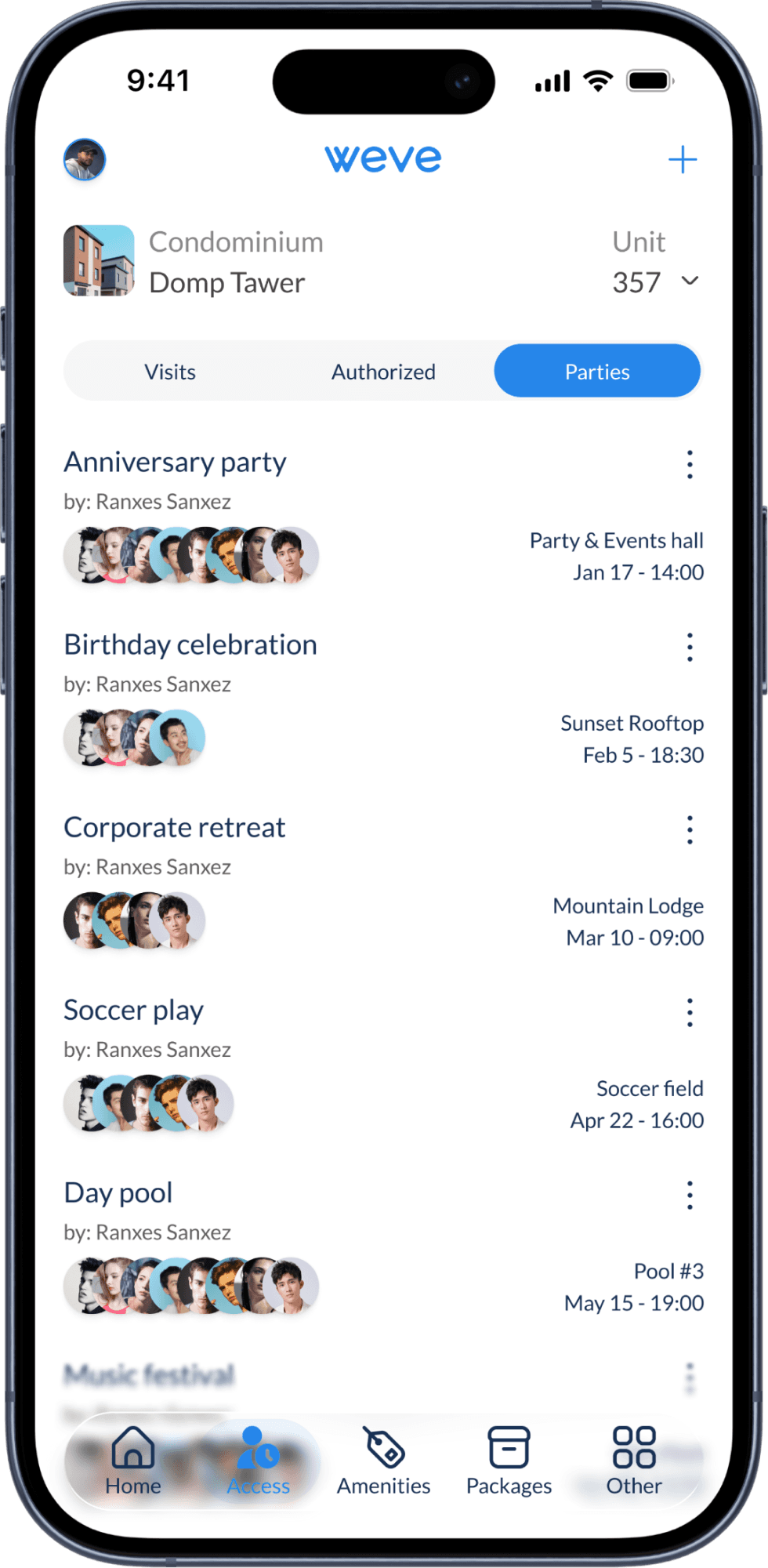
Parties
Group access per event
Add a visitor
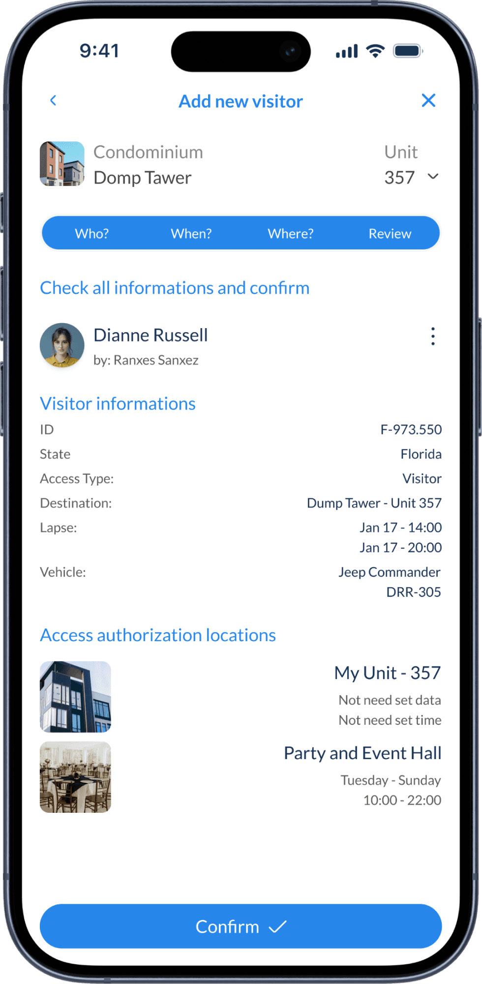
My first version asked for everything in two steps. It was too much for one screen. I split it into four questions: who, when, where, and a final review.
The vehicle section folds away when it doesn’t apply. Each location shows its hours and rules, so residents know the limits before they confirm.
Same information, smaller decisions.
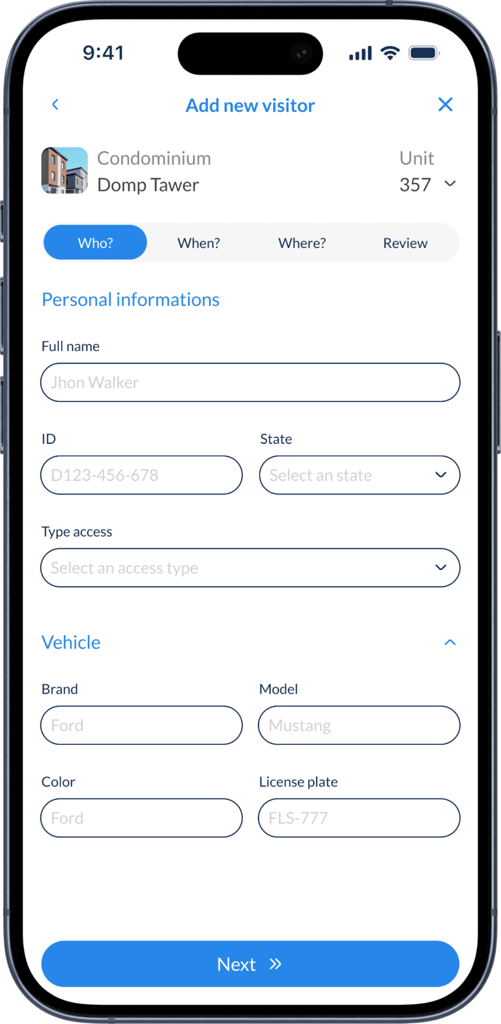
Who?
Vehicle folds away
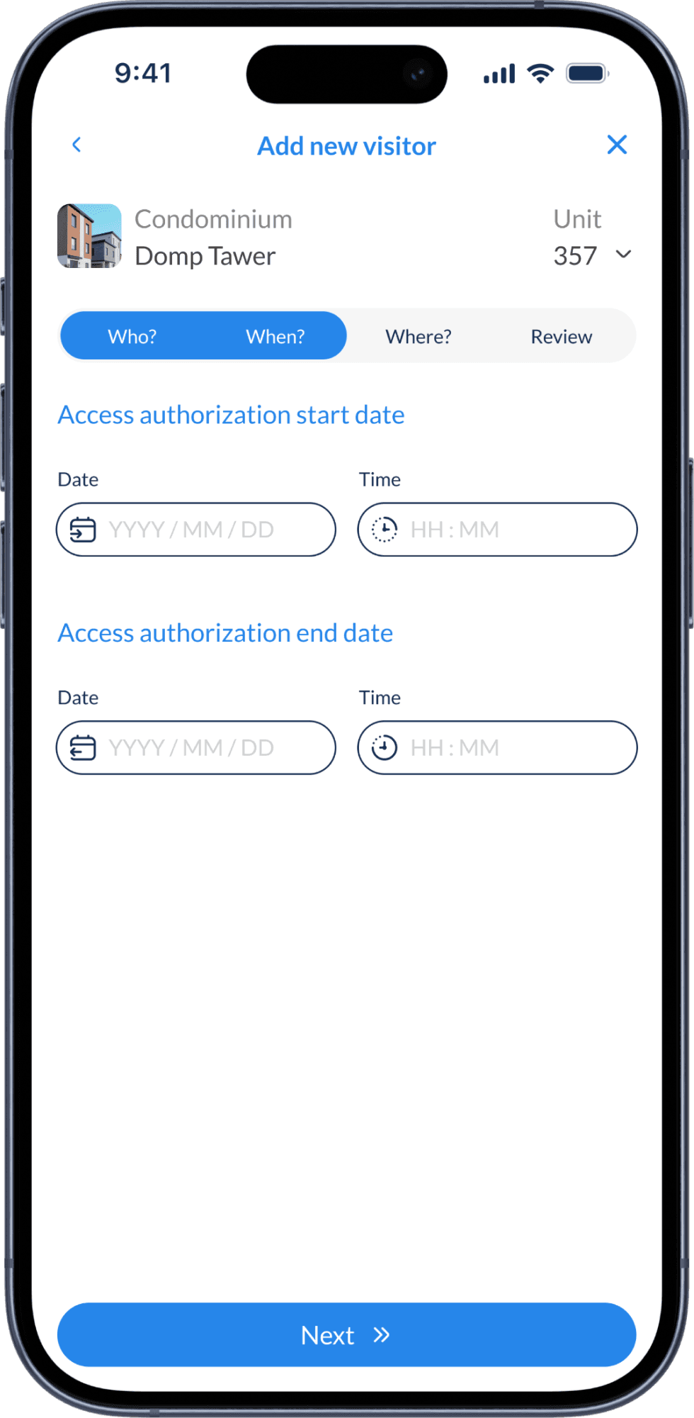
When?
A clear access window
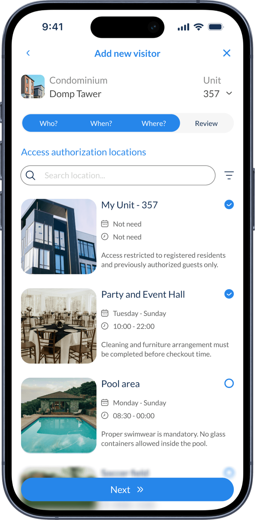
Where?
Rules shown up front
Review
Everything before confirming
L2
Actions · Amenities
Each space shows its price, hours and main rule before anyone taps. Booking is instant. The cost goes on the monthly condo statement, so there’s no payment step.
The confirmation ends in a QR code that opens the area. The reservation and the access permission are the same thing.
No one at the desk has to check a list or open a door.
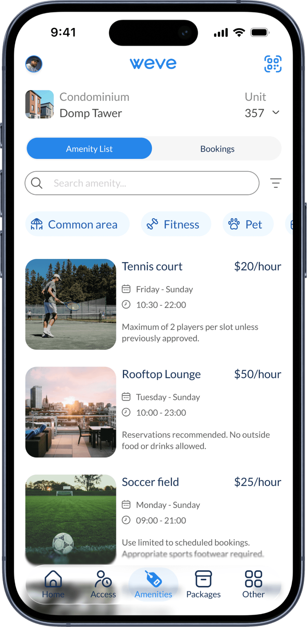
Amenity list
Price and rules up front
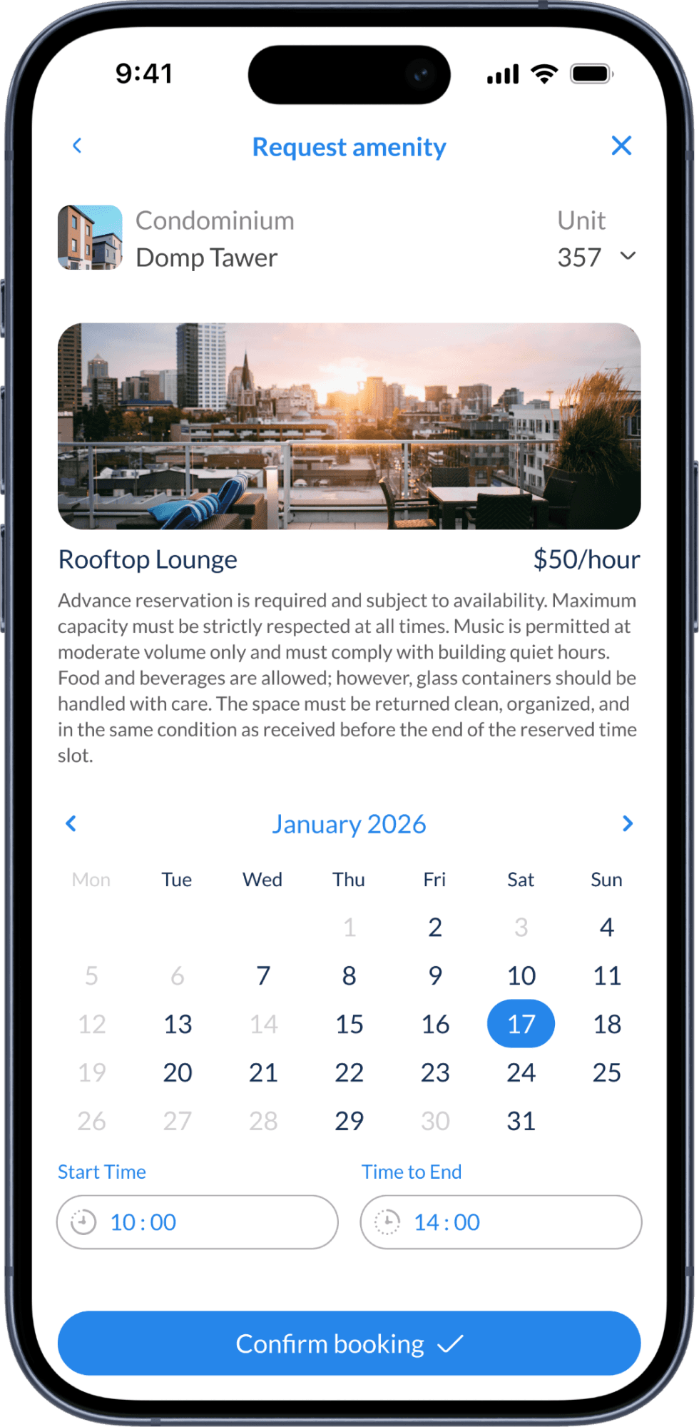
Request
Unavailable days disabled
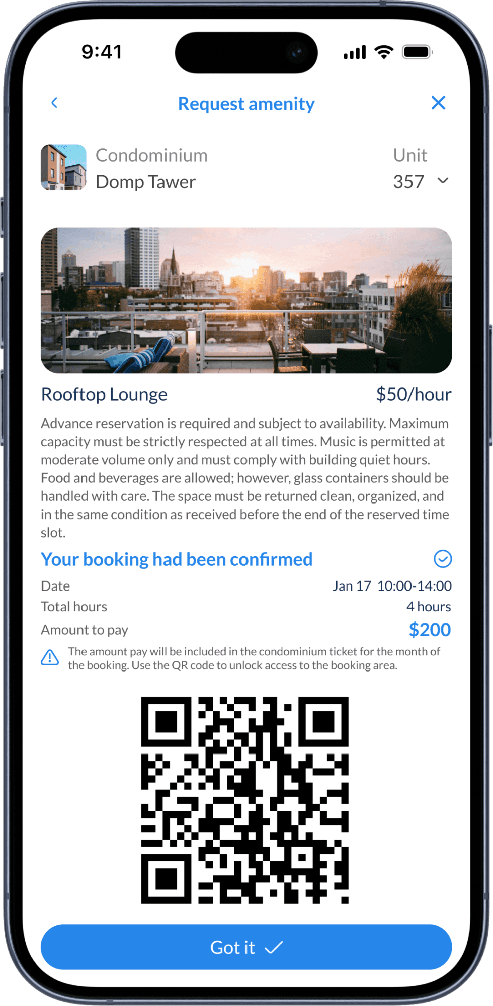
Confirmed
Cost and QR in one place
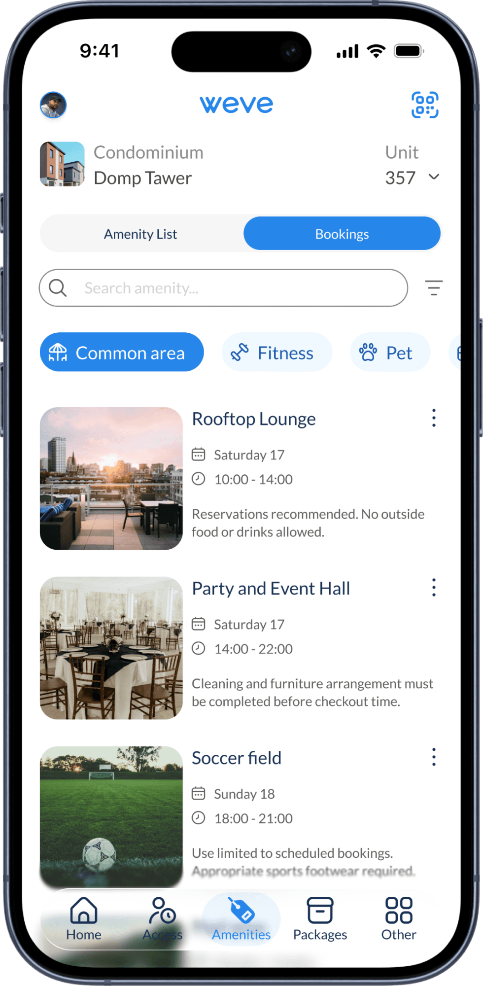
Bookings
Everything reserved
L3
Logistics
The list shows every delivery by day, with its status. The detail shows the full chain of custody: who delivered it, who registered it, and the exact rack and box.
The buildings have QR lockers, so the same screen is the key to the package.
Residents collect packages without waiting for someone at the desk.
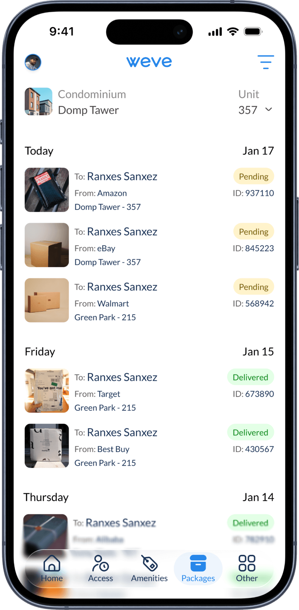
Deliveries
Status at a glance
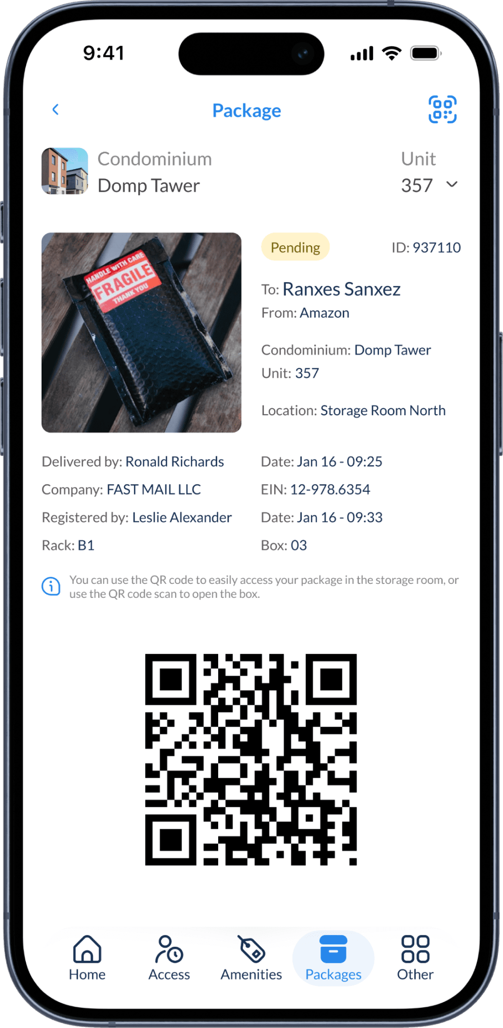
Package
Custody, location and key
05
One Saturday
Separating the layers didn’t split the experience. Here is one resident’s Saturday, January 17, as the screens above record it.
09:33
A package is waiting.
The front desk registers it and the resident gets a notification.
L3 Logistics
10:00
Rooftop Lounge, until 14:00.
Booked in one screen, billed to the statement, opened with a QR code.
L2 Actions
14:00
Anniversary party in the Party and Event Hall.
Guests come in as a group. Dianne Russell is authorized for the unit and the hall until 20:00.
L2 Actions
14:32
A service visit arrives.
Evelina Abernathy enters within her service window. The visit log records it.
L2 Actions
15:45
Maintenance notice.
Management warns that some common areas have temporary restrictions.
L1 Information
18:50
The service visit ends.
The exit closes the record, with no call to the resident.
L2 Actions
06
The system
Residents open Weve several times a week. Repetition only helps when the same thing always looks and works the same way, so I kept the system small: one blue, one typeface, one shape for every control.
Foundations
Color
Brand blue #2686EA · Anything you can tap
Navy #173054 · Text
Gray #888888 · Labels and metadata
Blue tint #EFF9FF · Chips at rest
Status Amber and green · Status only
Decision. Blue means “you can act.” Navy is for reading. Amber and green appear only on status, so they never compete with actions.
Typography · Lato
Personal information
Scheduled maintenance is in progress.
Access type · Destination · Valid
Decision. One family kept from the brand. Hierarchy comes from size and color, not from many weights.
Shape
Control
Content
Person
Decision. Pills are for acting: buttons, fields, chips and the segmented control. Rounded rectangles hold content and photos. Circles are always people.
Icons
At rest
Active
At rest
Active
Decision. Outline icons at rest, filled when active. The tab bar and the notification bell follow the same rule.
Components
Context header
Building and unit sit on every main screen. The selector serves residents with units in more than one building.
One control, three jobs
It switches views in Access and Amenities. In the visitor flow it fills up step by step, so residents read progress with a control they already know.
Field
Label above, example inside. The label stays visible while typing, and fields pair up when the data belongs together.
Primary button
Full width and fixed at the bottom. One per screen, with an icon that says where it leads: forward or done.
Category chips
Filter without leaving the list. Icons make categories easy to scan.
Status chip
Top right on every package, the first thing residents scan for.
Data card
Label left, value right. Every authorization reads the same way, top to bottom.
Floating tab bar
Five tabs, the active one filled and tinted. Content scrolls underneath it, so long lists get more room.
Patterns
One header action per tab
Notifications on Home, add on Access, QR on Amenities, filter on Packages.
Lists grouped by day
Notifications, visits and packages all read as Today, Yesterday, then dates.
QR as the key
Bookings and packages end in a code that opens the area or the locker.
07
Results
Every task has one home.
Information, actions and logistics live in separate tabs, and each tab names what it does.
Visitor authorization became four short questions.
What was one dense form is now a guided flow with a review before anything is confirmed.
Bookings and packages end in a key.
A QR code opens the area or the locker, so the front desk isn’t the only way in.
The same patterns everywhere.
The same components and patterns repeat across every tab, so learning one screen teaches the next.
Expected impact
The targets I set for the redesign, each tied to a problem from the audit. Values are indexed to the pre-redesign baseline (100). They are targets, not measured results.
Front-desk requests for tasks the app already does
target
Before
100
Target
65
Measured with: Front-desk web system logs
Time to authorize a visitor
target
Before
100
Target
60
Measured with: App analytics, start to confirm
Visitor authorizations completed once started
target
Before
100
Target
120
Measured with: App analytics, step-by-step funnel
Amenity bookings made in the app
target
Before
100
Target
130
Measured with: Bookings by channel
Package handoffs at the desk
target
Before
100
Target
50
Measured with: Locker openings vs. desk handoffs
Residents active each week
target
Before
100
Target
125
Measured with: App analytics, weekly actives
Post-launch metrics belong to the client and aren’t shown here.
08
Learnings
Structure before screens
Most problems came from where features lived. Fixing the architecture fixed more than any single screen.
Indirect evidence still counts
Without residents in the room, complaints and metrics kept decisions honest. Next time I’d push for direct sessions.
Smaller steps, lighter decisions
Splitting the visitor flow added screens, but each one asks for less.
What I’d do next
Mark entries, exits and package status with text, not only red and green.
Show the booking total before “Confirm booking”, not after it.
Show initials for new visitors until the scanner captures their photo.
Show availability by time slot, not only by day.
Darken the blue and gray used for small text to meet WCAG AA contrast.
Rename “Pending” and “Delivered” to “Ready for pickup” and “Picked up”.